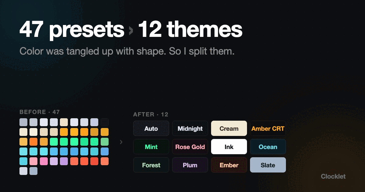
Neon had a preset called Cyan. Digital had a preset called Cyan. They were not the same thing. In the code they were two unrelated entries, defined in different places, and if I tweaked the blue in one of them the other one just stayed where it was.
That is the state I was in a few weeks before launching Clocklet, a menu bar clock for Mac. Nine faces, and a color list that had quietly grown to 47 presets. I thought a long list meant the app was generous. It meant the app was broken in a way I had not noticed yet.
How a clock app ends up with 47 of anything
Nobody sits down and designs 47 presets. You add them one face at a time.
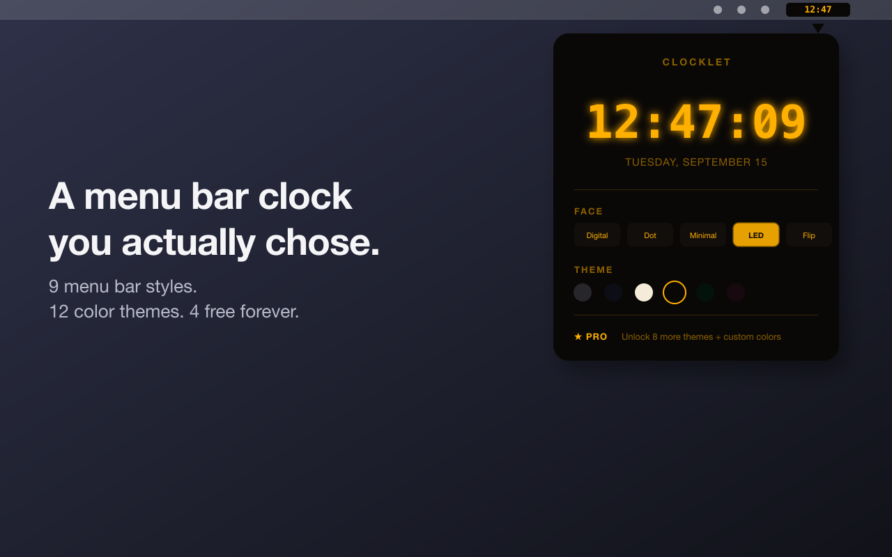
The LED face needs an amber, obviously, because that is what a bedside clock looks like. Then Neon wants a magenta, because neon without magenta is a waste. Flip is a split-flap board, so it gets ivory and it gets classic black. Every face I drew came with two or three colors that felt native to that face, and every one of those went into the list as its own entry. Seven faces in, plus the two plain ones that draw straight onto the menu bar, and the count was 47.
Each one was defensible on its own. Together they were a maintenance surface I had to keep in my head, and the picker had turned into a wall of swatches where roughly a third of them were near-black rectangles you could not tell apart at swatch size.
The bug that made it obvious
Here is the part that actually forced the rewrite.
A preset could only set the text color. The pill behind the digits was hardcoded per face, so a preset had no way to change it. The Gradient presets worked around this by shipping the same white digits every time and secretly tinting the background through the accent slot instead.
Which means the swatch you tapped in settings was not the color that landed in your menu bar. You picked a warm sunset swatch and got white digits on a background that was doing its own thing. I had shipped a color picker where the colors were a suggestion.
There was a second one. Because I could not guarantee contrast across all those combinations, there was a runtime function that flipped a color if it looked too close to its background. Sensible in theory. In practice it meant a preset named White could render dark, and the user who picked White had no idea why the app disagreed with them.
Two bugs, same root cause. Color was tangled up with shape, so neither one could be reasoned about alone.
Faces own shape. Themes own color.
The fix was one sentence long and took a full rewrite to honor.
A face owns its shape and typography. Digital is monospace digits. Dot is an LED dot matrix. Flip is a split-flap board, the kind that used to hang in train stations. LED is seven segments. Those are structural decisions and they have nothing to do with color.
A theme owns four colors: background, digits, accent, and an optional glow. Nothing else. Midnight, Cream, Amber CRT, Mint, Rose Gold, Ink, Ocean, Forest, Plum, Ember, Slate, plus Auto, which is the only one that follows your system appearance.
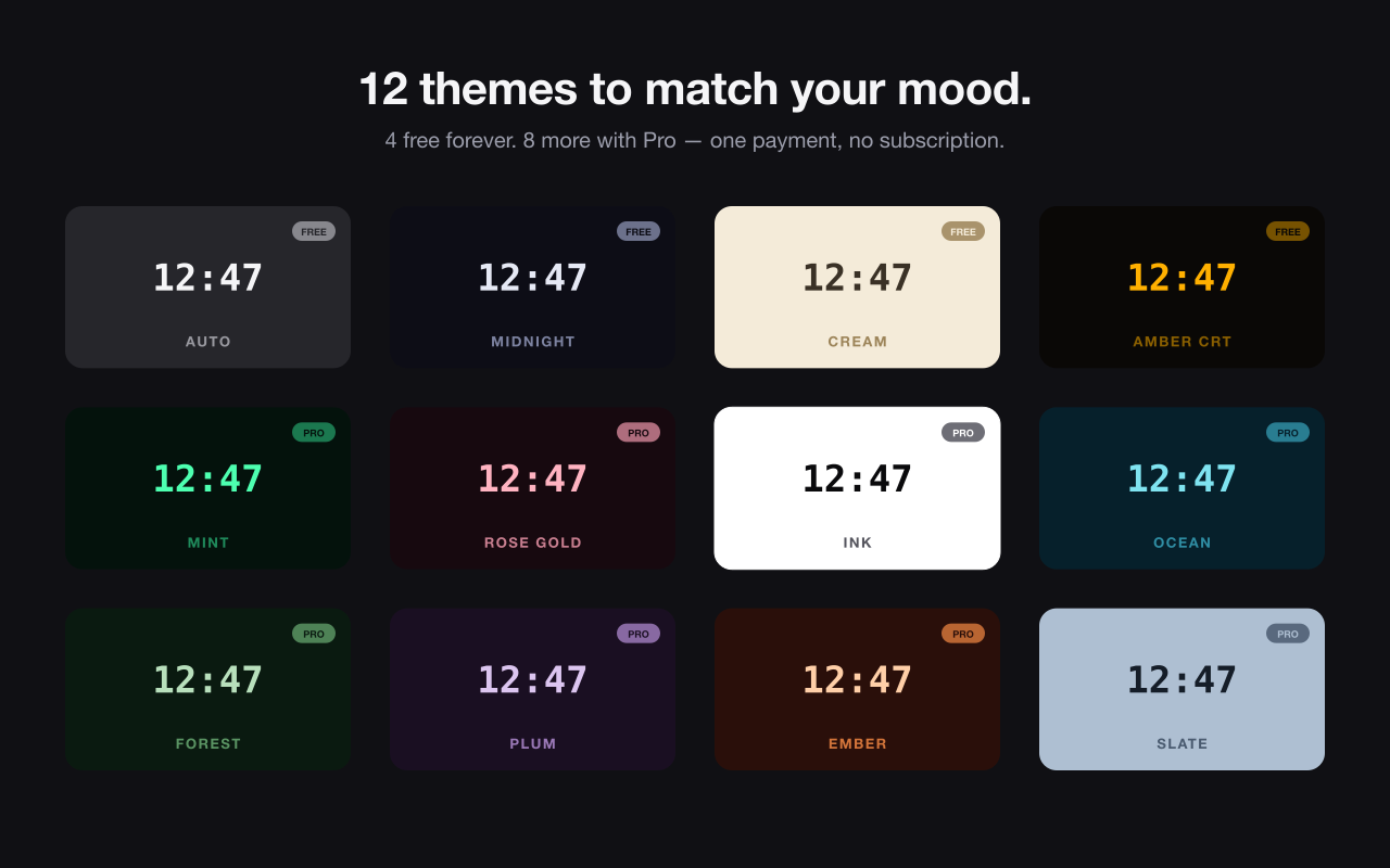
The other eleven do not follow anything. That was deliberate and I went back and forth on it. If you pick Midnight on a light menu bar, you get a dark pill. The alternative was making every theme adaptive, which sounds nice until you realize the name stops describing the result. A theme called Midnight that turns pale at 9am is not a theme, it is a mood ring.
47 entries became 12. Nine faces times twelve themes is 108 combinations, which is more than I had before, and I now maintain 12 things instead of 47.
The part I could only do after the split
Contrast stopped being a runtime guess.
Once color lived in exactly one place, I could write a test that walks every theme and asserts the digits clear 4.5:1 against their own background, the accent clears 3:1, and the glow, where a theme defines one, clears 3:1 too. It runs in the test suite. If I add a thirteenth theme with a pretty but unreadable palette, the build tells me before you ever see it.
That check was impossible in the old design. There was no single place where a color and its background were both known.
The runtime flip is gone. Nothing overrides what you picked anymore, because nothing needs to.
Migrating people who had already picked something
I kept a lookup table mapping every old preset to its closest new theme. Ten of the 47 resolve to Ocean alone: Neon Cyan, Digital Cyan, Dot Cyan, Neon Blue, Digital Blue, Dot Blue, LED Blue, Flip Blue, Typo Teal, and Gradient Ocean. Eight amber-ish presets collapse into Amber CRT.
Writing that table was the moment the whole thing stopped being a judgment call. Ten entries mapping to the same destination is not a color system. It is the same color written down ten times.
If you are staring at your own settings screen
The count is the tell. When a customization list grows past what you can hold in your head, it is usually not richness. It is two axes that got multiplied together because they were never separated in the first place.
Look for the multiplication. Mine was color times face. Yours might be theme times layout, or preset times mode. Split them, and the list gets shorter while the actual number of results you can produce goes up.
The other tell is a bug you keep working around instead of fixing. My Gradient presets had a workaround sitting in production code for weeks. I read past it every time because it worked. It did not work. It just did not crash.
Clocklet
Clocklet is my app, so treat this as a design note from the inside rather than a review. It is a menu bar clock for macOS 14 or later. Nine faces, twelve themes, and options for seconds, 24-hour time, and the date. It lives in the menu bar with no Dock icon, and it does not talk to a server, because a clock has no reason to.
The free tier includes all nine faces and four themes: Auto, Midnight, Cream, and Amber CRT. One adaptive, one dark, one light, one with character. Pro is a one-time purchase that unlocks the remaining eight themes, a custom palette where you set the background, text and glow yourself, and font size control for the menu bar clock. No subscription.